Table of content
Due to these advantages, the industry has become highly competitive; according to Statista, there are around 17,000 SaaS companies in the US, with around 59 billion customers worldwide. That’s why to win buyers’ attention, businesses should invest in an attractive and engaging design, among other things connected with web development.
Based on our experience, companies want a trendy design that stands out in a competitive market yet accommodates the unique characteristics of their business models, streamlines the user experience, and optimizes functionality. That’s why this guide arranges the top design trends along with the best SaaS website examples.
When you decide to build a SaaS website, you should see how the best practices work in practice. Our Devox Software team provides you with this knowledge.
What Makes SaaS Websites Unique
In simple terms, SaaS websites are unique when they have a few key design elements that set them apart from other types of websites. But this task is not that easy to achieve, considering the amount of SaaS designs already existing on the market.
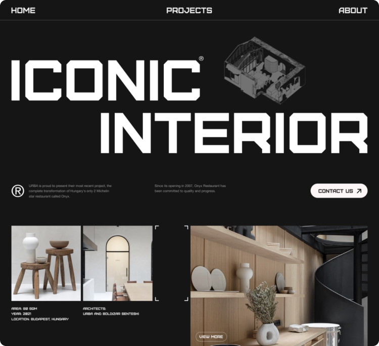
These days, unique SaaS websites need to be sleek, modern, mobile-friendly, look great, and focus on simplicity and ease of use. However, our experience shows that a unique appearance in design is not an end in itself. Sometimes the ease of use, intuitive navigation, and ability to generate more conversions matter more than the possible aesthetical preferences of the client.
For example, when we designed ActivePlace, a health-related social media platform and marketplace, our primary task was to address the preferences of different user categories and guarantee a personalized experience for any visitor. In the cases like these, the unique SaaS product design is the one that covers all the customer needs, looks attractive, and incorporates the best design practices.
7 SaaS Best Practices
So, how to make a SaaS platform design that addresses your customers’ needs, generates conversions, and looks trendy? We’ve collected the top 7 practices that can help you cover all these tasks at once.
Mobile-Friendly Design
Mobile devices are expected to reach 18.22 billion by 2025, and your website design should address this trend. These days, a website that looks great on a computer and a mobile device is a must.
Easy Registration
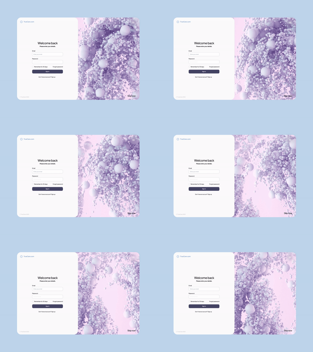
To increase conversion rates, we recommend that SaaS businesses focus on making the registration process easy for users. How can you do this? Reduce the required fields, use social media login options, and provide clear instructions.
This design practice is a part of a user-friendly interface that is made with typical customer behavior in mind. Specifically, it lets users quickly find features without getting frustrated. If you want to make your design intuitive, consider simplifying your interface to the maximum and removing unnecessary elements.
Smooth Start
The user interface is the first thing your users will interact with, so it’s important to make a good impression. A smooth start means designing an interface that is both visually appealing and easy to use. Minimalistic design, large buttons, and clear labels are all key elements of a smooth start.
Even more, it should be easy for users to start using your SaaS product. In terms of design, it means simplifying your UI and improving navigation. Label your buttons and make headings big enough to eliminate any guesswork possible.
Make such a design that even novice users can figure out how to navigate through your app without feeling lost or frustrated.
Smart Search
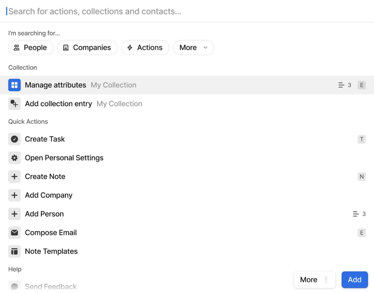
Search bars are essential parts of navigation, so you should design SaaS products and dedicate extra work to the way users find the information requested. Put a big search bar at the top of the homepage that has a drop-down menu for users to select the type of results they’re looking for. Also, put another search bar at the bottom of each page in case users forget what they were looking for and want to start over again.
While designing search bars, remember they should be user-friendly. Make it possible to input different types of information, including text queries, images, and video or sound files (if applicable). But don’t overload it: users will get frustrated seeing many search options. Another mistake is offering nonsense or contradictory results in search outcome, relying more on machine logic than human behavior.
Features with Great Accessibility
Ease of navigation is another must-have feature of a good SaaS design. The elements here include shortcuts to all main features, minimalistic yet comprehensive menus, and smart search bars that address all customers’ questions even before they come to their minds.
Besides, your website should address website accessibility standards. Make all functionality available from a keyboard, don’t use content that causes seizures and let visitors read text versions or subtitles for your audio content.
Informative Dashboards
The dashboard is the first thing users see when they log in, so it needs to be both informative and visually appealing. To achieve this, designers tend to use minimalistic colors and particular fonts that are easy on the eyes and include only the essential information.
Data visualization, graphics, and illustrations are other great tools to improve your dashboard. Make sure you’re using them strategically — too many visual elements could lead to a cluttered screen, while too few might confuse your user. Remember, it’s all about striking a balance between simplicity and functionality: try to “humanize” complex data you have with infographics or simple visuals, making it easier for people to understand.
Personalization
A successful SaaS product personalizes the user experience as much as possible. Here, you need to have as much information about customer behavior as possible. Therefore, apply various analytics tools and use all possible channels to collect customer feedback at any stage of interacting with your product.
In the next step, you can start creating custom dashboards for each user and tailoring the interfaces to their specific needs. Using analytical data will also drive your future design decisions to maintain a truly personalized experience for them.
If you need more information on best practices, check out the best web design trends in 2022 to improve your SaaS design even more.
Design Thinking Methodology
Design thinking is a methodology that provides a solution-based approach to solving problems. It is often used in designing new products or services and can also solve business problems. In this section, we’ll show the key steps in design thinking.
Step 1: Empathize
To design a new product, it’s important to understand the needs of your users. That’s the aim of the empathize step in design thinking, which lets you put yourself in your user’s shows and try to understand their needs and motivations. Commonly, you will collect real feedback through interviews and observation of the behavior of your target audience here.
Step 2: Determine
The goal here is to map out your solution, be that a new product or service or something as simple as a problem statement. This step lets you make sure you aren’t just creating an arbitrary design but defining an approach that leads to solving a problem. The result here is a Proof of View (POV) as a clear problem formulation linked to the users’ needs.
Step 3: Generate an Idea
After you’ve created a vision of what your final solution will look like, your next step is to generate ideas. This is where brainstorming and creativity come into play. It’s helpful to involve as many people as possible in generating ideas, especially because anyone can contribute insight from their personal experiences.
Step 4: Make a Prototype
After you’ve generated a range of ideas, it’s time to determine which are feasible. Many tools can help you assess your options and find a solution that aligns with your strategy and meets the needs of your users. In this regard, prototyping allows you to create models of potential solutions and evaluate the viability of each to choose the best one.
Step 5: Test
The testing step lets you put your prototype in front of users and get their feedback. Remember that usability testing is never finished — you should always be able to improve your product based on real user insights. Through continuing iteration, you can ensure that your solution resonates with your audience.
7 Best Examples of SaaS Websites
By 2028, the SaaS market is expected to reach more than $344 billion in value, so it’s no surprise that the demand for best design practices is on the rise. Here are seven examples of the SaaS website best practices you can use as references for your winning SaaS design.
#1 Shopify
Shopify has several awesome design elements worth paying attention to. From the top of the page, the website invites users to start a free trial and shows how future product cards will look on the marketplace. Then, it depicts category examples and describes the advantages of using Shopify. By the end, you see a nice globe animation demonstrating the platform’s popularity and capabilities. The navigation is straightforward and user-friendly, divided by “Start,” “Sell,” “Market,” and “Manage” menus.
Shopify website shows a nice example of how to integrate different design elements with the idea to demonstrate the competitive advantages of your SaaS product.
#2 Dropbox
Like Shopify, the design of Dropbox, the cloud backup and file sharing platform starts with a CTA button and has an easy-to-use and intuitive customer-facing side. Also, the home page has numerous colorful images, attracting website visitors to share their files via the platform. The important part is listing partner integrations with popular services like Trello, Google Workplace, and Zoom to stress the platform’s usability. By the end of the page, Dropbox publishes customer stories to increase credibility.
This website design is a good way to rely on visual elements and existing integrations to promote your product.
#3 Asana
Asana’s design is remarkable for having personality and humor. Notwithstanding numerous screens on the homepage, the smart usage of animations, minimalistic design, and well-thought flow overall don’t overwhelm users with what they see. The navigation menu includes typical “Why us?,” “Features,” “Resources,” “Pricing,” and “Contact Sales” pages, which is a good idea if you want to make your design user-friendly and intuitive.
On the home page of Asana, you can find project management functionality (both described and visualized), case studies (with details both described and visualized), integrations (with a great design decision that makes an impression they are endless), and customization options.
It’s a great website example that shows how to place a lot of information on one page.
#4 Slack
Slack’s SaaS design on the first screen contains several CTA buttons and the “digital HQ” motto. This is a good way to encourage users to actually try your product — however, pay attention to the number and appearance of buttons not to make a messy design by following this website example.
Compared to other websites mentioned here, Slack’s homepage is short, containing the partnership information, features described and animated, illustrative stats, and customer stories section only. At the same time, the navigation menus hide all the rest information, letting you dive deeper into sections placed on the homepage or discover product capabilities, possible solutions, enterprise cooperation, and pricing plans.
Overall, this homepage design is a brilliant example of only depicting the essential information about your SaaS product.
#5 Hubspot
Throughout the website, Hubspot uses strict tile and table-like design, creating unified branding and demonstrating an ability to maintain a straight-to-the-point approach.
The minimalist and short content doesn’t mean less value; it means more focus on what’s important to users. Each block in Hubspot design contains the important information only, meaning clear headings, descriptions, and CTA buttons. The live chat is a key element here, letting the service answer the questions that may appear.
If you’re a fan of short pages with minimalistic design, Hubspot is your reference.
#6 Figma
The company that has created one of the main designers’ tools has a nice SaaS design itself. Its SaaS website home page feels like you’re already using the product. Even more, Figma contains several engaging animations, divided by “Brainstorm,” “Design,” and “Build” sections. The navigation menu, in addition to the typical “Products,” “Enterprise,” and “Pricing” submenu, offers to browse the Community resources to get started with the product easier.
If you have an opportunity to introduce unique design elements, you can use the Figma website example for reference and inspiration.
#7 DocuSign
The service for electronic signatures has a design where each block contains product keywords, meaning “agreement,” “contact,” and “eSignature.” Like other websites mentioned here, DocuSign’s home page contains CTA on top, functionality descriptions and visualizations, a list of possible integrations, and customer feedback. At the same time, the brand has extra blocks for brand partnerships and stats for trust.
Given that DocuSign is the youngest service among the brands we’ve listed in this section, the structure of this home page can serve as a bright example for SaaS startup websites.
How Much Does It Cost to Design a SaaS Product?
The cost of designing a SaaS product varies depending on the features and complexity of the product. A minimal design project may be up to $5,000, while an enterprise-level design project could be $30,000 – $50,000 or more.
The basic SaaS app requires spending on
- Research: On average, a SaaS app contains 100 screens, and working on the competitor research, user flow and other artifacts requires up to 2 weeks. If you decide to collect in-depth user interviews, it may take another week.
- Prototype (layout and actual prototyping): Usually, this step takes around a month, with one screen taking around 2 hours of work.
- Visual design: Another month of working on the UI part of your SaaS product.
- Polishing the design: It’s a good practice to put three weeks on time on all the changes and communication during the project.
Considering that a small SaaS project takes around three months and a skilled designer’s average rate is in the rage of $35-45 per hour, getting a design will cost you around $16,800 – $21,600.
Besides, it is worth noting that many factors impact the final price, including:
- The design team size requested,
- The amount of content needed to be designed,
- The visual complexity of the design requested (the presence of icons, illustrations, or animation),
- The need for UX research for your product,
- Your particular needs not covered by the average SaaS design cost.
Collecting all this information allows a design agency to estimate your software project’s exact cost.
How We Do It
Devox Software is a custom web application development company delivering software development with a personal touch. Our UI/UX expertise centers around creating eye-catching and user-friendly designs that increase the conversion of SaaS products. To check our work’s quality, look at our portfolio.
What you’ll get from Devox Software:
- Cost estimation for your project
- Personalized design for various devices (including mobile)
- Wireframes, prototypes, and mockups
- Visual UI design
- Guidance through the design process according to design thinking methodology
- Custom design that applies best practices described in this guide
- UI/UX consultations
- Maintenance services
With flexibility, facilitation, a well-planned development process and people as our main assets, we are ready to take full responsibility for complex UI/UX tasks. By applying the design thinking methodology, Devox Software designers are ready to conduct research, turn your idea into a prototype that solves users’ problems, and create a full-fledged responsive design with engaging elements for them.
Next Steps
As you can see, the world of SaaS design is constantly evolving. To stay ahead of the curve and design the best solutions, it’s vital to stay abreast of industry changes. But the best designers are those who can imagine what is possible with today’s technology and design yet create a product that serves your particular business and your customers’ needs.
Refer to us if you’re interested in getting a SaaS product with exceptional design. We at Devox Software offer complex UI/UX and web app development services, including designing user interfaces, improving user experience, making custom web and mobile designs, introducing responsiveness, and building SaaS CRM design. We can work with projects of any complexity, as our portfolio shows.
Contact us, so we can discuss together how to incorporate these best Saas design practices into your project.


