Table of content
Web Design Trends in 2022: Examples & Inspiration
Web design is a very important branch in creating the visual part of the site. This includes the development of the layout of the future web resource, the structure of web pages, and the main colors and design elements that will be present. All this plays an important role in the creation of the site. Based on the visual part of the site, users get the first impression of the web resource. Therefore, you need to pay a lot of attention to design.
But it is not enough just to have good taste, be creative and be able to do beautiful things. We must not forget about website design trends. Your site may be beautiful and unique, but if it is outdated, and does not correspond to modern technologies and design features, then it is unlikely that everything will come to conversion. Therefore, in this article, we will look at the most relevant web design trends that will interest everyone.
What to Expect from Web Design in 2022
Let’s move on to the main new trends in web design with modern website examples.
1. Daring and bright colors
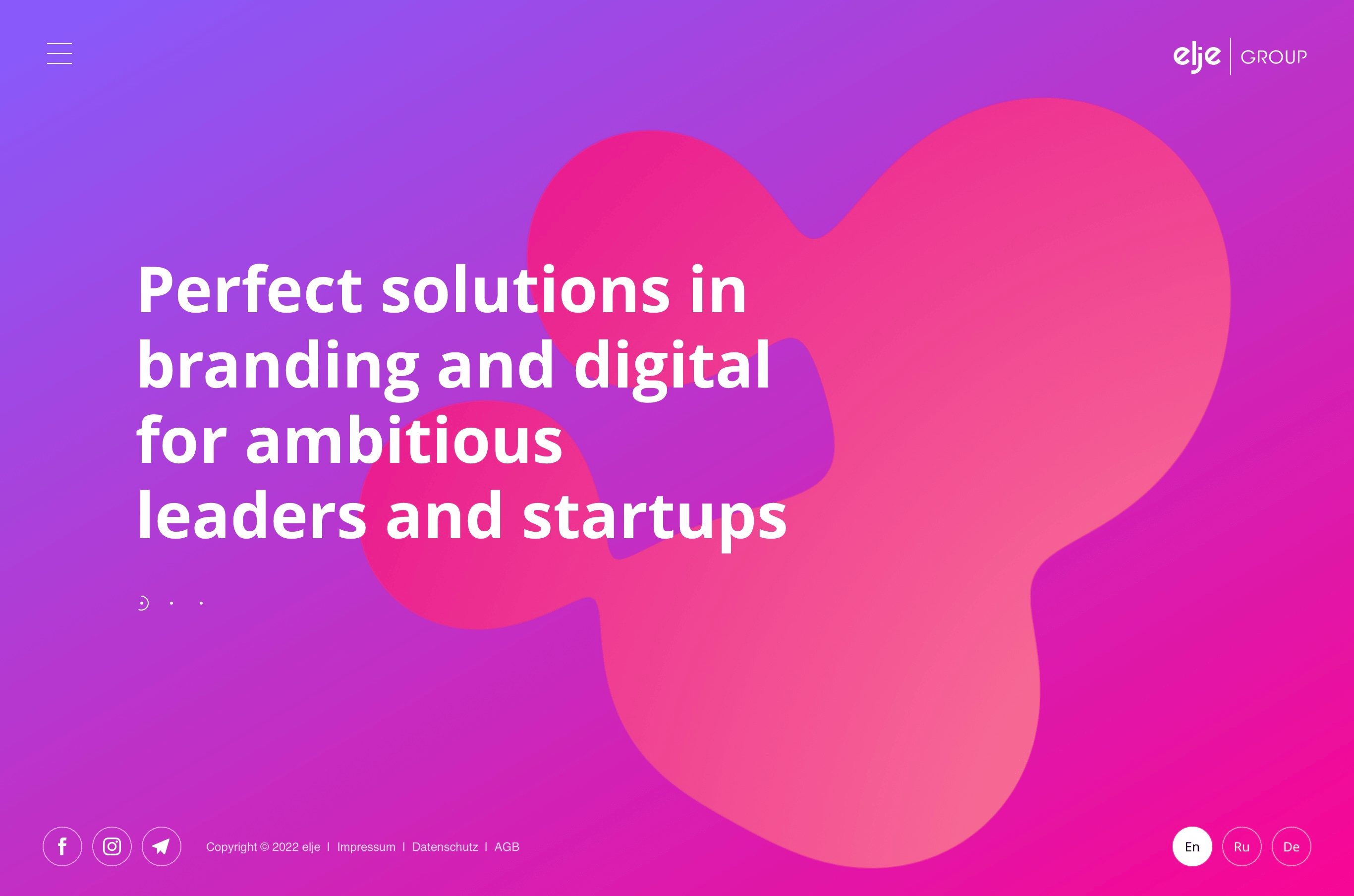
If, when visiting web resources, you pay attention to their color palette, you may notice a certain pattern. Most sites choose simple, discreet, and light colors. As a rule, they do not pay any attention to themselves. Most often, this choice looks boring and not interesting. Therefore, one of the current website design trends is bright and bold colors that grab attention.
A good example would be the elje-group. The company uses in its design unusual, bright colors that immediately attract attention. Such a bold decision sets you apart from everyone and makes your web resource stand out from the rest.
2. Brutal typography
Another bold trend is rough and contrasting typography, which immediately attracts attention with its massiveness and unusualness. This is the exact opposite of minimalism, lightness, and optimism. Such typography is a very unusual modern approach for the best modern website design.
With this approach, you create your site like a metropolis. Elements such as massive letters of different sizes, giant headings, and lots of details help convey a special atmosphere that will distinguish a web resource from others.
Bergen-assembly is a great example of this trend. There you can see fonts of different types and sizes and typographic styles associated with boldness.
3. Large font and contrast
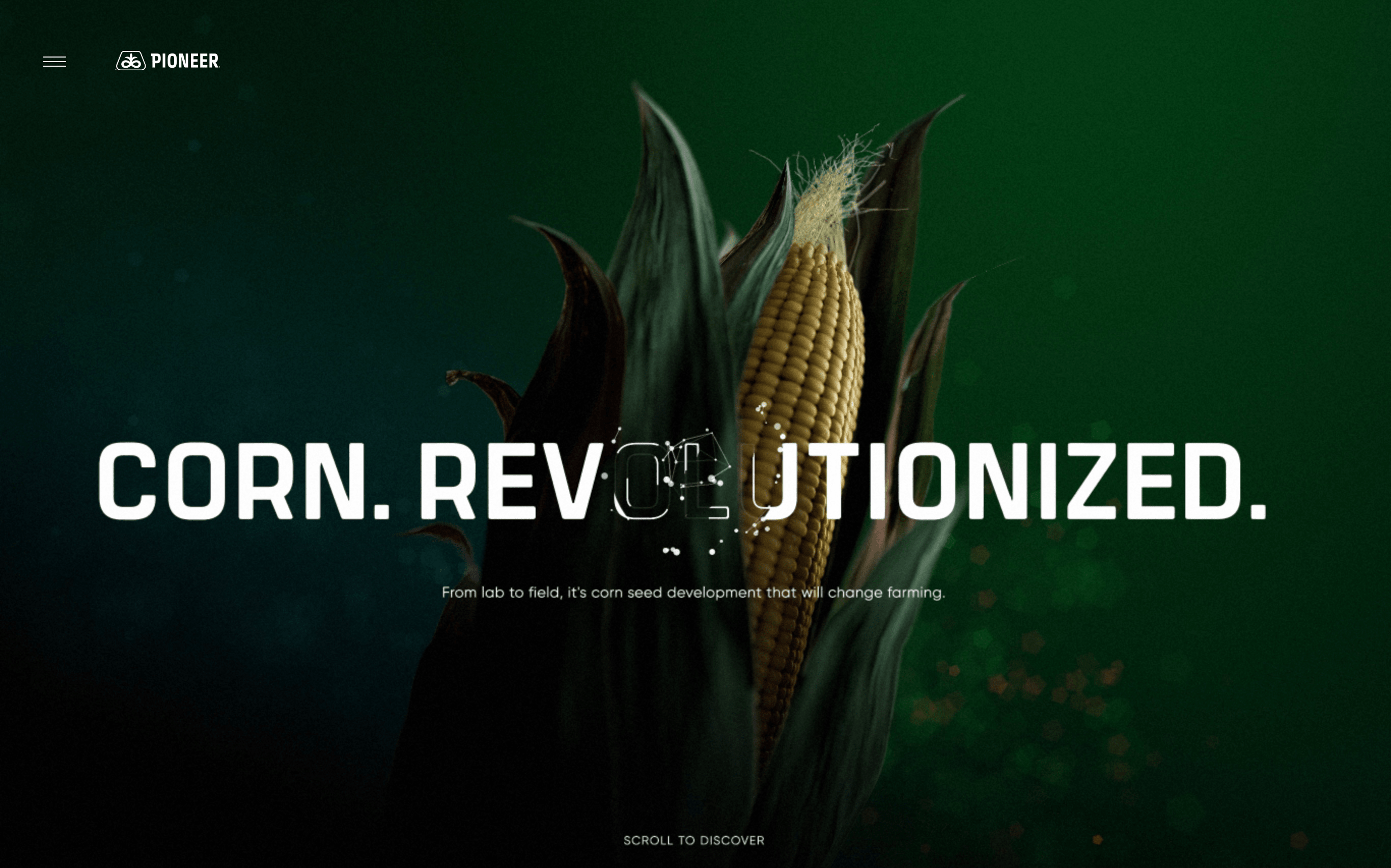
Let’s move on to the next interesting design, which takes pride of place among the latest web design trends. We will talk about a large headline against the background of a semantic image.
Previously, no one could think of using text and an image at the same time. It seemed to many that the picture could distract from the text or vice versa. At that time, for designers, this was considered something incompatible, but now everything is changing. Now, this idea seems very interesting, unusual, and trendy.
Consider the example of the site “Corn Revolutionized”. We can see a bright picture and quite remarkable text. This approach looks stylish and attractive.
4. Geometric shapes
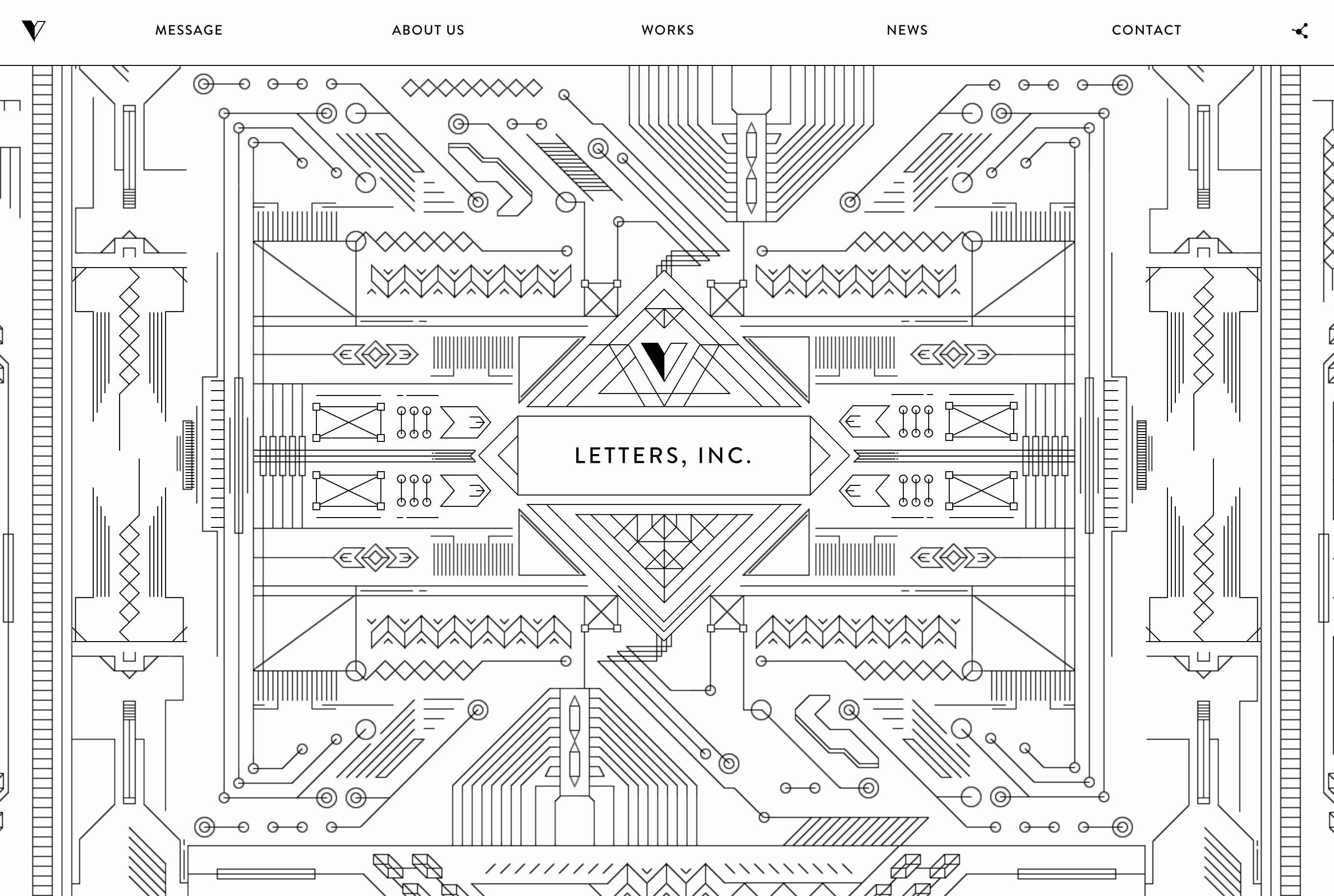
What could be more attractive and interesting than geometric shapes of different types and colors? This is also a rather bold decision among most website design trends since most often geometric shapes look bright and catchy. This design can be attributed to something abstract and not ordinary. Thus, users will feel a special atmosphere with unusual and catchy figures.
This practice is used very often, so you can find many examples. In this article, we will look at the site from letters-inc. If you look at the main page, you can see an unusual and complex picture that has to be site. Such geometric shapes look stylish and show that the designers are confused about the site.
5. Retro style or vintage
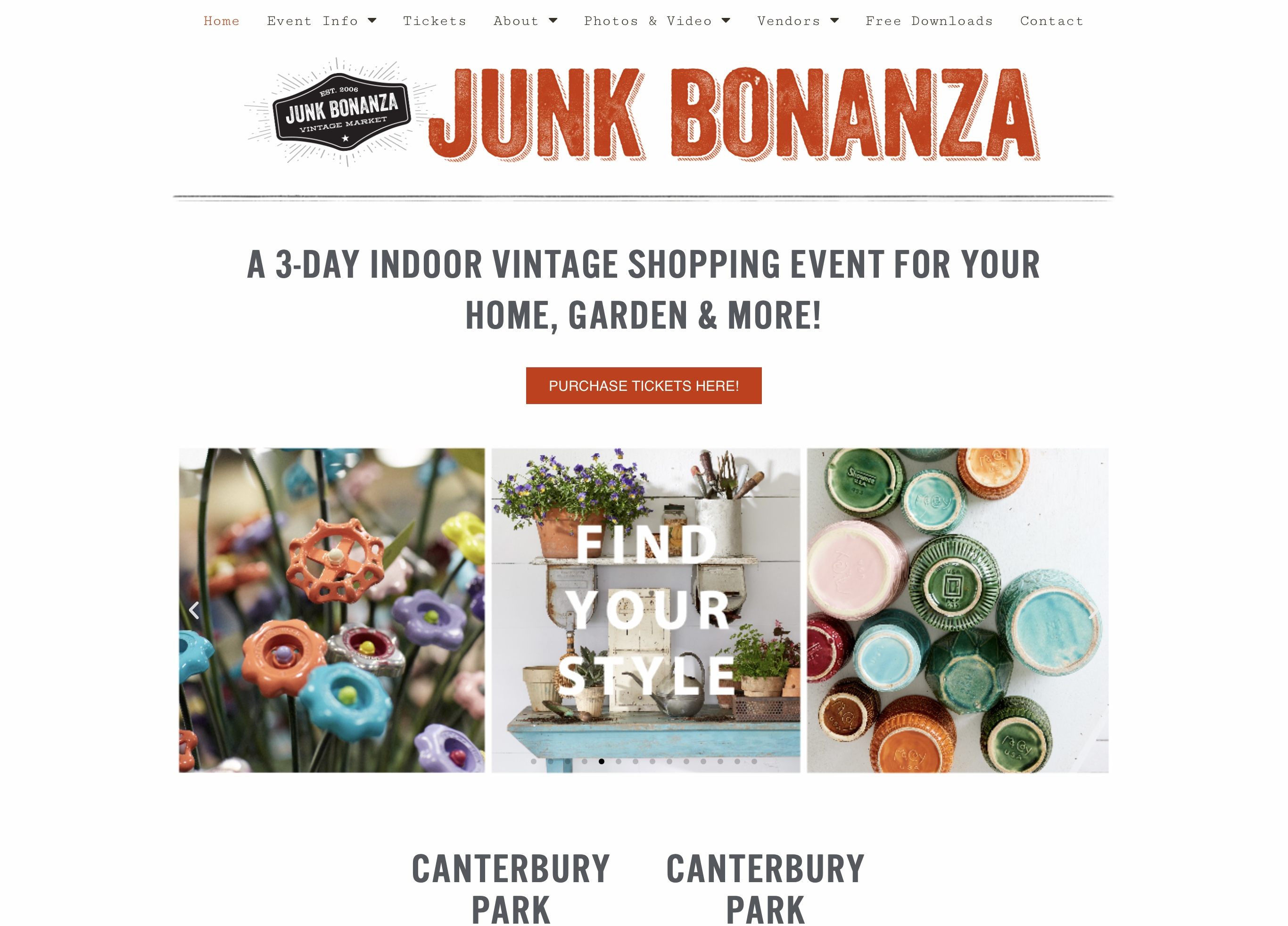
This website design can be called a return to the past. Such a trend in web design implies a reflection of the past era and culture of the past. The retro style of the site is intriguing, creates a sense of value, and subconsciously inspires confidence in visitors. This type of design is always memorable. Therefore, among a large number of web design trends, many choose the retro style.
Consider an example of a website designed in this style. A bright and high-quality example will be Junk Bonanza. The site resembles old newspapers and evokes a feeling of nostalgia and pleasant emotions. These are very useful emotions that will help to attract users to your company and send them pleasant past feelings and sensations.
6. VR
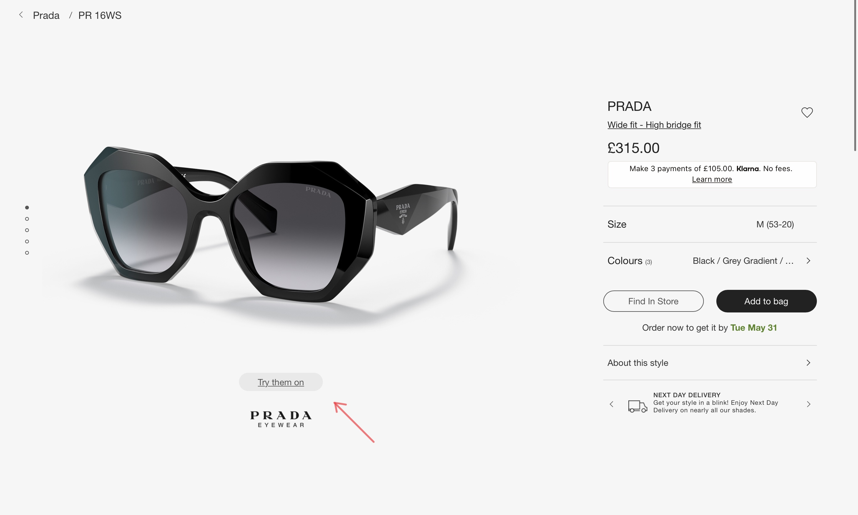
Virtual reality seems to us still such an unattainable technology that we should still expect and expect. But in fact, VR technology has long been a part of our lives. It is increasingly being used in practice in various applications, games, websites, and other important developments. This is a super modern technology that will not leave any of your website visitors indifferent.
Virtual Reality Technology Gives users the impression of being a strong technology company that has come a long way in terms of modern developments. Thus, you inspire the trust of users, and also help them decide on a purchase decision.
A good example of a VR site is sunglasshut. This is an online store with a large selection of luxury glasses, but before ordering any model, you have the opportunity to try on glasses using VR technology. Thus, you will understand whether such a model of glasses suits you or not. What could be cooler and more convenient?
7. Use small animations
Not surprisingly, micro animations have taken their place of honor among the latest web design trends. Animation has always made the site unusual and interesting. This is where micro animations come into play. As the name suggests, these are small animations. But despite its size, it still draws attention to your site.
Of course, animations have been used for a long time, but in 2022 the essence of such storyboards is to be organic and show the user their products, or rather the process of using them.
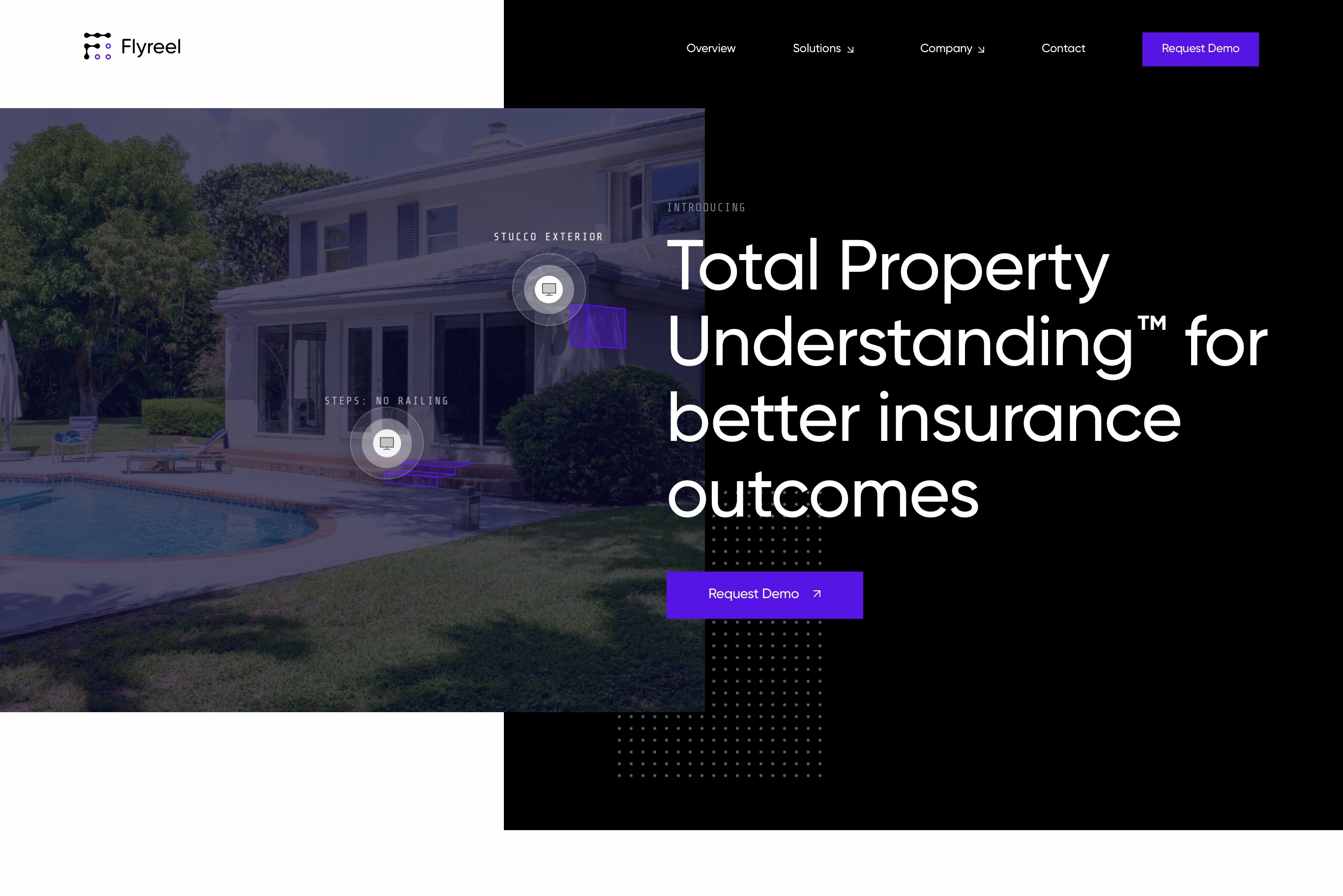
Flyreel added a small animation to their page that shows the essence of their work and makes the site more interesting and attractive to users.
8. Classic Fonts
Have you heard that classics are always in fashion? This applies to any field of activity and web design is no exception. Therefore, if you want your site to always look trendy, use classic fonts. This is a simple, discreet but beautiful website design option that will always be relevant.
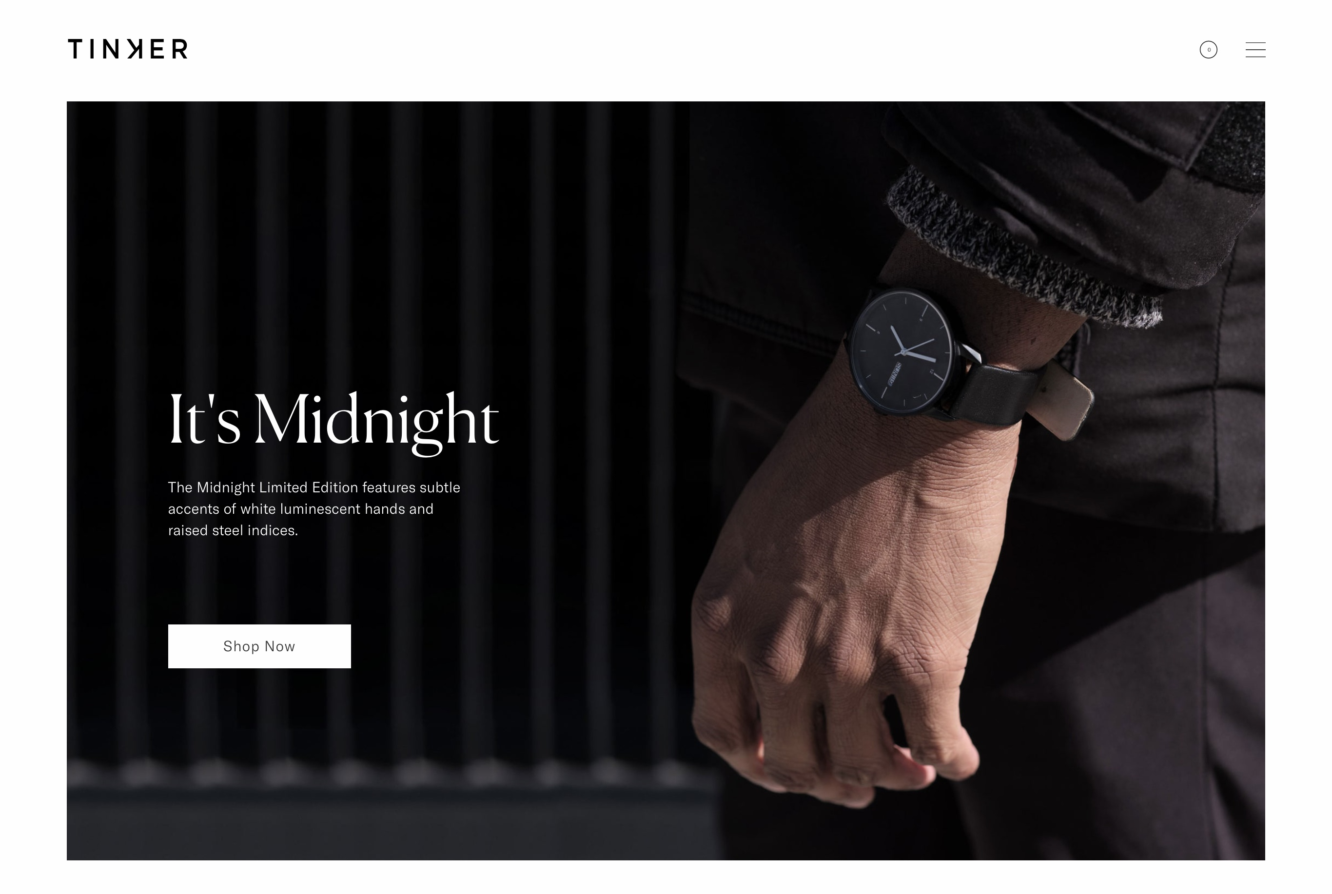
Consider an example from Tinker Watches. The site mainly uses classic fonts, but it still looks beautiful, restrained and elegant, and most importantly stylish. Therefore, if you are afraid to experiment with bright colors or geometric shapes, choose the classics.
9. Muted colors
Muted colors are no less relevant than bright ones. Of course, they differ from each other and evoke different emotions in consumers, but they both deserve attention and are among the website design trends.
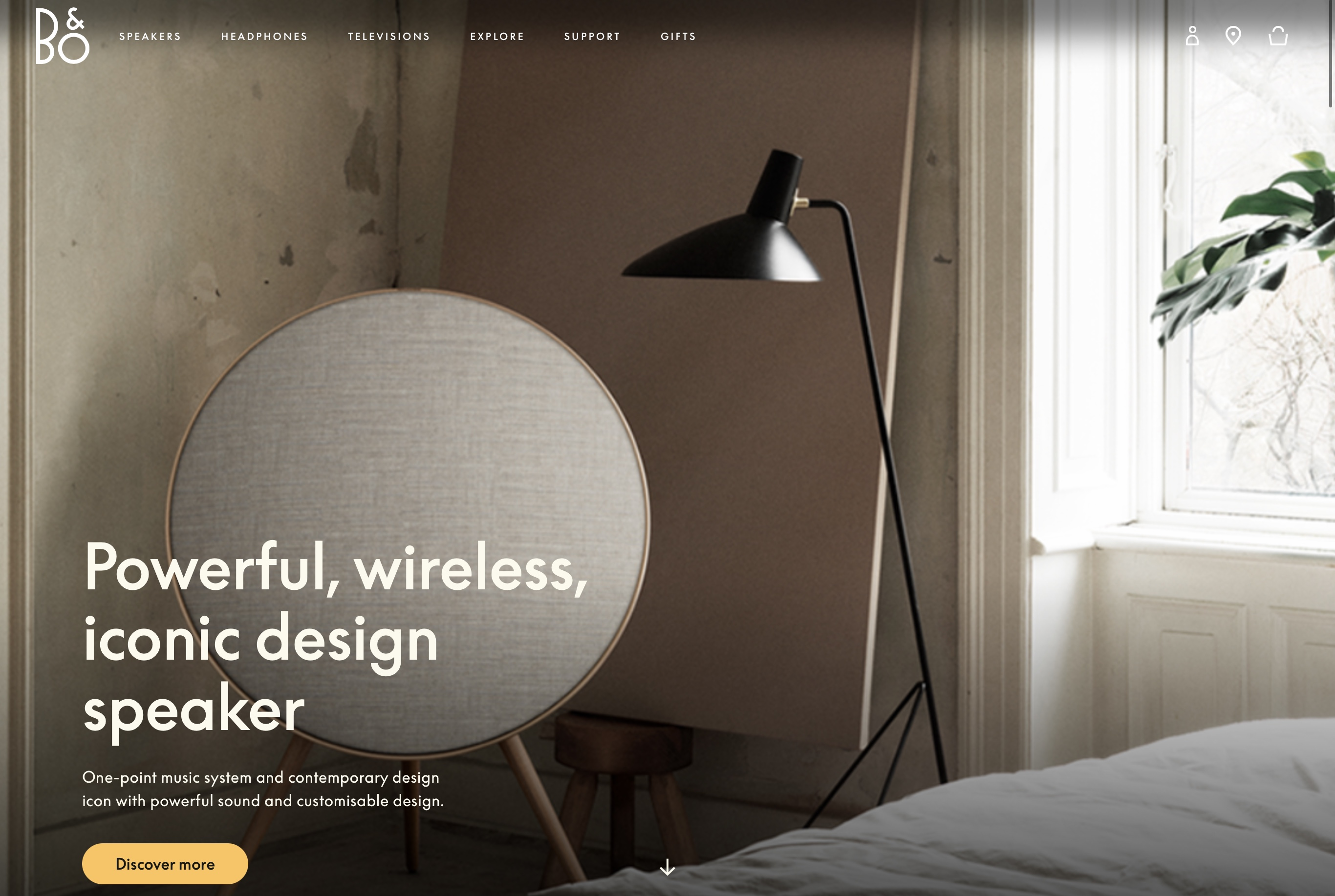
An example of the use of muted colors is the site bang-olufsen. On the web resource, you can see shades of muted colors, which at the same time look noticeable and stylish.
10. Meaningful video
It’s no secret that videos are perceived better than text messages. Therefore, platforms such as YouTube, TikTok, and Instagram Reels are actively gaining popularity.
Web resources also began to actively use video content. Unfortunately, you can not just take and put any video. This should be a meaningful and interesting video that shows all the benefits of your product or service. If earlier it was possible to add any video from YouTube, now you need to work on high-quality content.
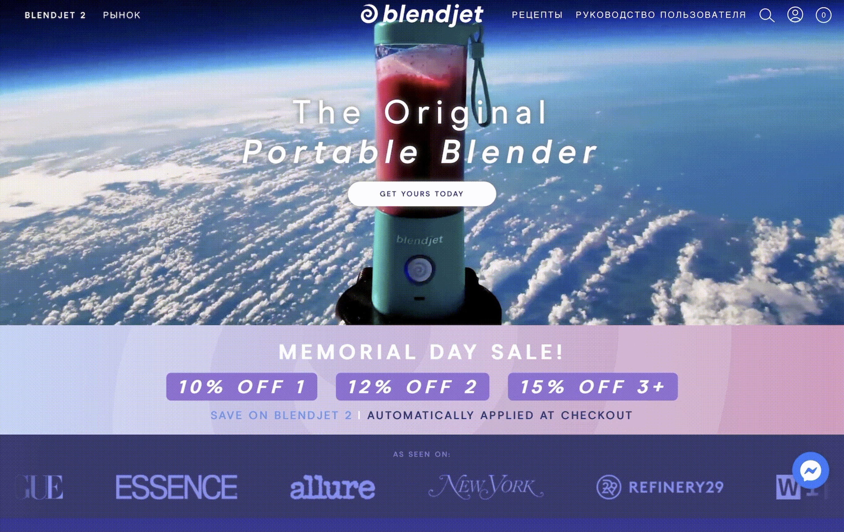
An example of adding an interesting video that tells everything about the product in a few seconds and shows its advantages is the blendjet company. On their page, there is a unique author’s video that captivates and interests everyone.
11. Dark background
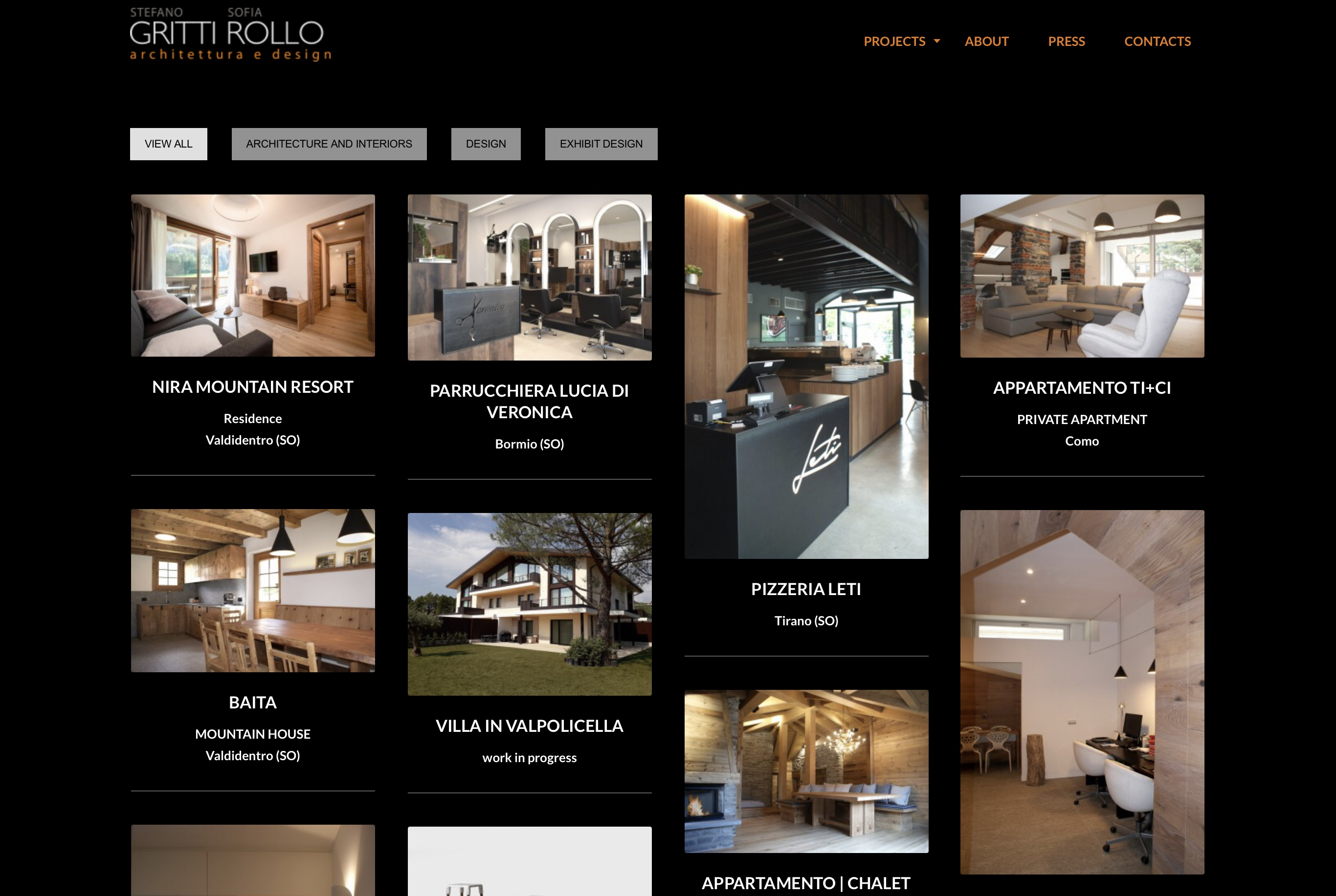
The dark color, which is taken as the basis on the site, looks quite stylish and modern. Another advantage of dark colors is that eye strain is noticeably reduced, which is a concern for many users. Thus you can complete two tasks at the same time.
On the web resource gritti rollo we can see that dark colors predominate, which makes the site ultra-stylish, elegant and sophisticated. The main thing is not to forget about harmony in colors, since the line between gloom and elegance is very thin.
12. Using 3d objects
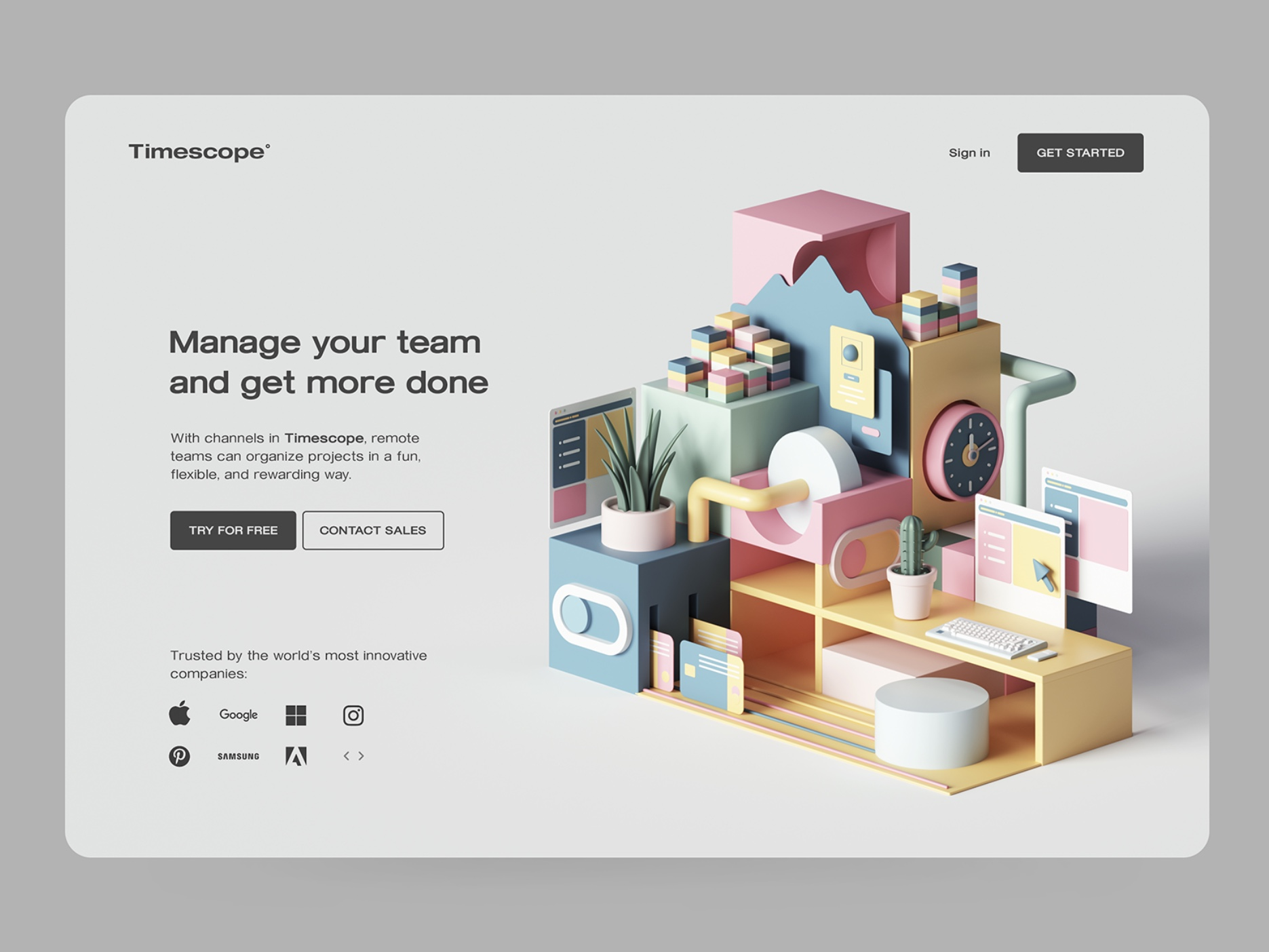
Nothing makes a site as eye-catching as the use of 3D objects in the design. This is a three-dimensional digital image of the necessary object, both real and fictional. They look beautiful and unusual, and will also increase conversions well.
An example of the use of such unusual three-dimensional figures is the timescope. 3D elements immediately fall into the attention of the user and make them stay longer on the site.
13. Multicolor gradients
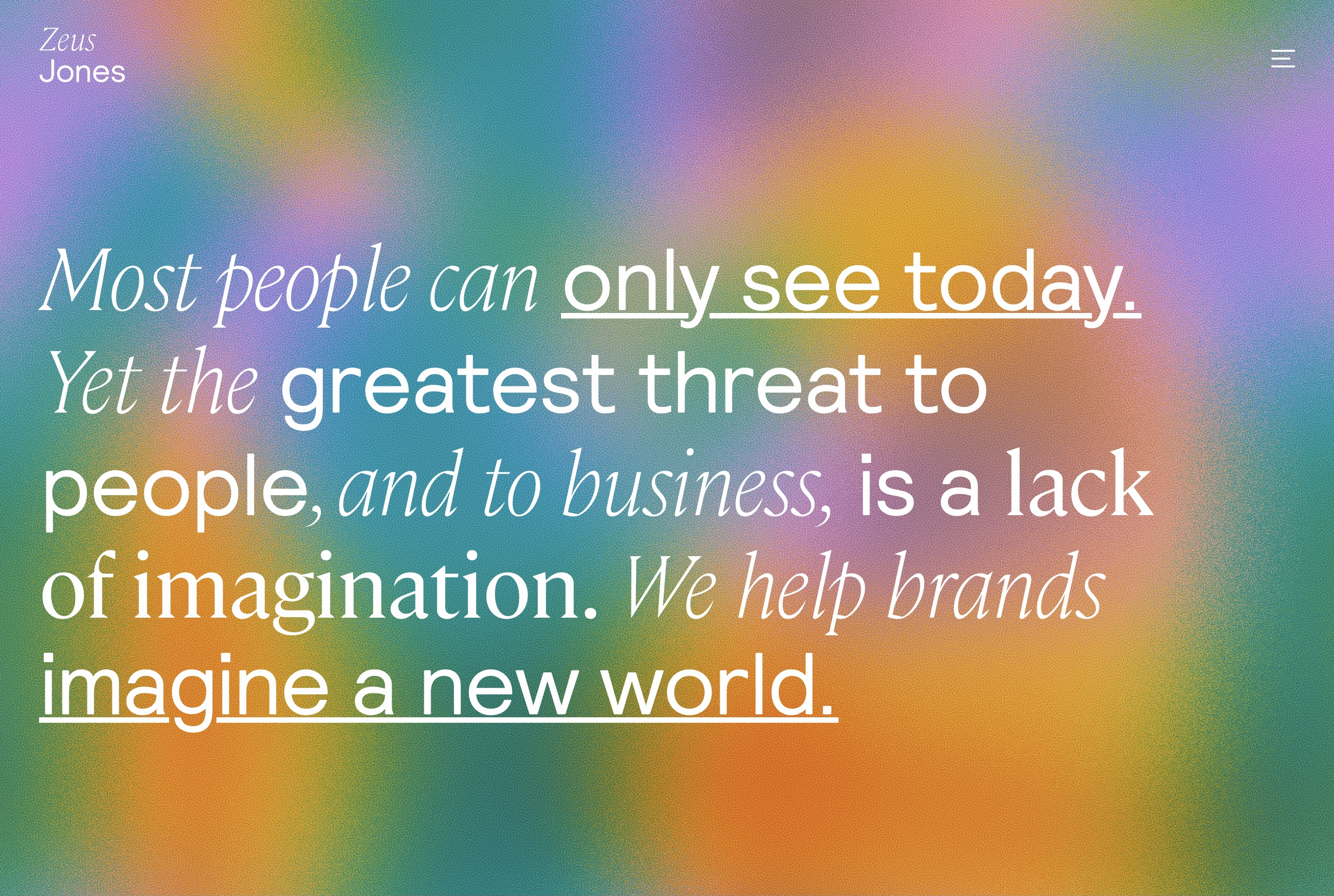
It may seem to many that gradients are not something new and relevant, but this is not the case. Gradients have come a long way in being modified to make it onto the web design trends list. The most relevant version of such colorful patterns is complex gradients. It uses vibrant colors of pinks, purples, oranges, and blues that look unusual and vibrant.
An example of complex gradients is the Zeus Jones site. There we can observe a bright combination of colors that shimmer.
14. Website in the style of the 90s
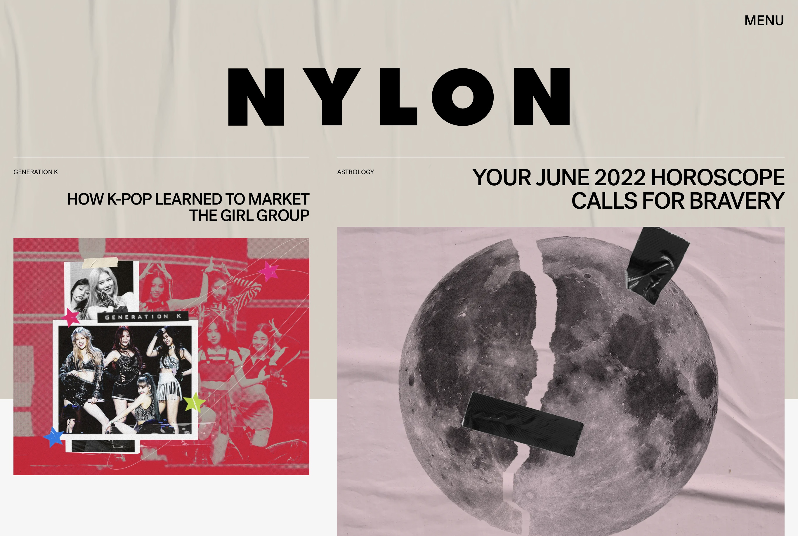
Another retro trend is the 90s style. This style is actively used in video games, fonts, and many other areas. Web design is also not left out. A large number of companies prefer this style, as it evokes nostalgia, pleasant memories, and emotions.
An example of a stylish application of the style of the 90s is the site from NYLON. If we look at the home page, we can see a cool and quirky style that looks both modern and retro at the same time.
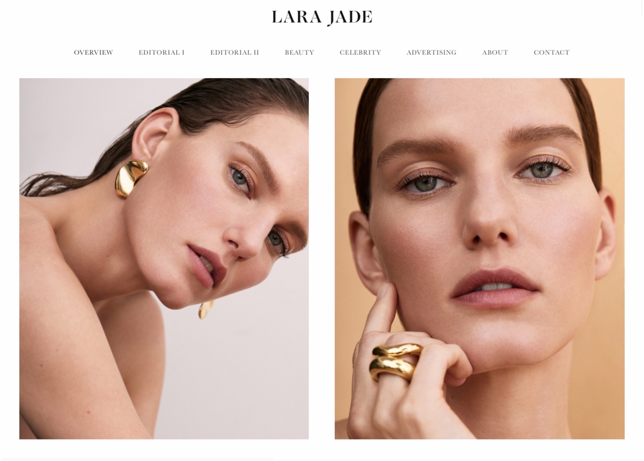
15. Photos of people
Previously, to make a beautiful photo in a catalog or on your website, people invited models and used a huge amount of photoshop. But now everything is changing, especially the ideals of beauty. Now simplicity, sincerity, and naturalness are relevant.
Now, among the latest web design trends, there are photos of people with different skin colors, characteristics, and shortcomings, of different ages and genders. Using images of real people without photoshop and invited people, you have more potential site visitors.
On the Lara Jade website, we can see simple live photos on the main page without a lot of photoshop and makeup. Everything is very natural. This is what attracts visitors to the site.
Conclusion
To create a good web design, you need a good team, a sense of taste, and knowledge of trends.
The most important thing is not to use all possible trends, it is better to stick to one style that will be of high quality and well done. Because it is really necessary not to overdo it.
An important role is played by the team with which you will cooperate, so choose proven web design services in which you will be sure. Therefore the web design of your site will be unique and cool.


![Devox Software is Ranked Among Best-Performing B2B Companies [Clutch Report 2022]](https://devoxsoftware.com/wp-content/uploads/2023/05/getty-images-9IENlqTm5ds-unsplash-1024x652.jpg)
