Table of content
The idea that you only need a browser and an internet connection to create a workplace for a team, design a site, organize an event for 1000 people, or make your coffee wait for you in a cafeteria and not vice versa, brings a great diversity of Saas products to life.
According to Gartner forecast, the worldwide end-user Saas spending will rise from $152.2 bn in 2021 to $208.1 bn by the end of 2023. Such tremendous growth dictates the fierce competition in the digital market. It’s becoming more and more challenging to find your product-market fit and decrease customer churn rates on the numerous steps of the client journey.
Devox Software has been developing web and mobile SaaS solutions for startups, SMBs, and enterprises since 2017. In this article, we describe how to improve engagement with competent SaaS UX design patterns and UI best practices.
Saas UI And UX Design: What Is The Difference
UI and UX Design usually work closely together, but they are not the same. UX and UI focus on different aspects of the SaaS development process.
Saas UX Design
UX design means ‘user experience design,’ and it is not only about software. UX includes the overall human feeling of the product. Anything you can experience — a website, a car, or a visit to the dentist refers to UX.
What’s the task of the UX design? To develop and improve the quality of interaction between a user and a service. Thinking about any site or an app, you can recall structure elements that shape the customer’s interaction experience: the registration form, number of clicks to reach the main function, additional features, and how fast you can get the clue of using them.
Saas UI Design
UI stands for ‘user interface design.’ While UX design is responsible for the structure and functionality to make a client happy, UI design focuses on visuals.
When somebody first opens the site or the app, it’s like a first date. Do the color scheme, title font, all those icons and buttons, spacing, and imagery attract or overwhelm? And would you like to go further, or maybe not?
UI designer thinks about the product’s look, feel, and interactivity. Therefore, the user interface should be as intuitive and friendly. Every visual or interactive element the user might encounter is in its place and helps to engage and guide the client.
UХ and UI design complement each other. For example, if you imagine your SaaS as a human body, the functioning organs will represent the UX, while UI will reflect the make-up, the clothes, and the high heels.
Importance of Сreating a Great SaaS UI/UX Design
Have you ever stopped using an application after having a bad experience due to poor usability? Of course, there could have been some cool features and eye-catching design but still, it wasn`t it.
The main goal of the UX/UI design is to increase user satisfaction by streamlining the experience from software. Before making any change, it’s good to go analyze
Work on SaaS UX Design
When you create a SaaS, it’s crucial to think about the overall customer experience and improve the product consequently one tiny step by another.
Functionality
The product’s value lies first of all in functionality. The exclusive features to make the product unique come first. Before adding new options, UX designers should carefully consider if they bring new value to customers. Changes might also complicate the navigation or aim for needless perfection. Keep in mind that your solution should be workable and competent, and that is the path to the best SaaS UX design.
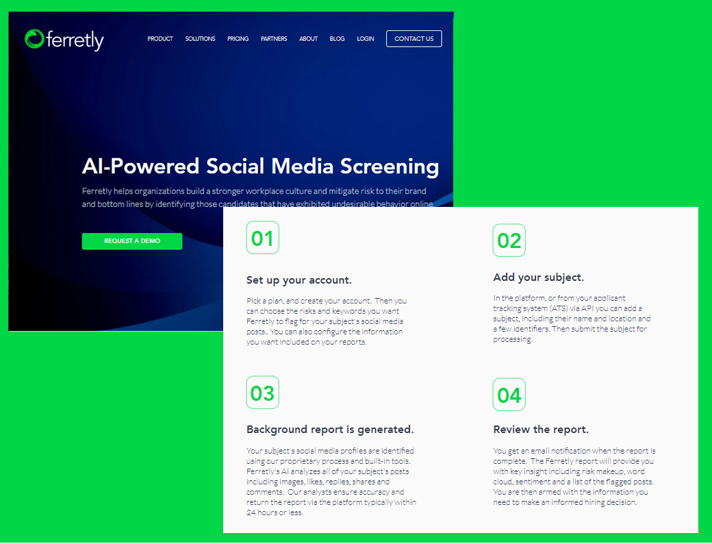
In our case of a social media background screening platform Ferretly the main function was to analyze data stored in posts and images across 14 distinct risk classifications such as bullying, self-harm, hate speech, violent communication, or images.
The registration form and navigation are plain and minimalistic. But the core function brings obvious value to the recruiting firms and self-employed workers. Ferretly helps to manage employment risk in all industries and government.
Devox team has developed a SaaS solution based on advanced machine learning and artificial intelligence (AI) technologies. It’s also remarkable that the previous vendor rejected the platform idea, saying it was impossible from a technical standpoint. Well, satisfied active users prove this to be wrong.
Prototyping
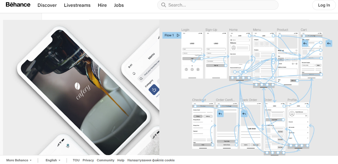
You could save time and energy on the prototyping stage of Saas UX design. There are handy tools like Figma or Miro to visualize your customer journey and avoid excessive branches.
The low-fidelity prototype for the Cafery app connects the primary user flow of browsing a menu and making a cafe order in advance with pick-up or delivery options.
Testing
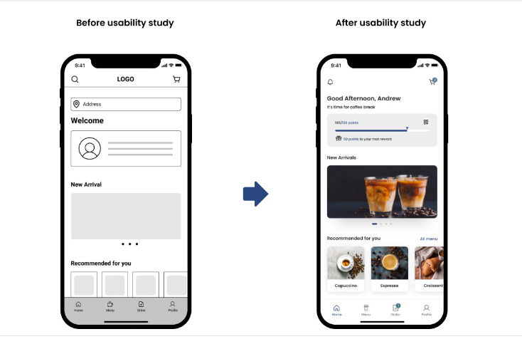
The best way to adjust the Saas product for people`s demand is to test it as early and frequently as possible. For example, you might launch a survey on social nets or find beta-testers for the simplest clickable prototype. Any real human feedback would add value to the resulting SaaS UX design product.
Streamline Navigation
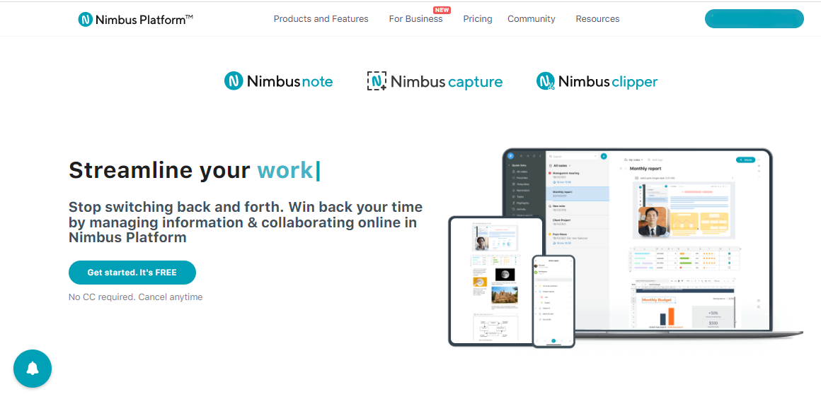
One of the main things to consider is easy and intuitive navigation. The first screen should display the links to the main product’s information so that users won’t waste time scrolling for a `Try it!` button.
On the Nimbus Platform site, three main products, Nimbus Note, Nimbus Capture, and Nimbus Clipper, are straight above the title. They’re hard to miss as well as the Call-To-Action button.
Navigation is a crucial part of SaaS UX design, for it can either engage a client to discover the service or push him away from the first page.
Powerful Search
When the user starts searching for additional information through the SaaS platform search engine, it`s a precious sign of trust. Forcing your visitor to browse through hundreds of pages aimlessly could result in customer churn.
The rule of thumb is to ensure a well-adjusted search so your customers can instantly find what they are looking for. Employ SEO tools and specialists if you want to develop a robust search option.
User-friendly Sign-Up
There are two main types of SaaS onboarding
- registration form
- step-by-step onboarding
The UX community has no standard opinion on which approach is more effective. Conservative designers vote for a registration form because of its pragmatism: new clients fill all the fields in one go. Others argue that asking too much information at a time will overwhelm users and nudge them to leave.
Both options have pros and cons, but we suggest making the choice depending on your target group:
- If you’re dealing with internet savvy, you can feel free to lead them through a concise registration form, which will save time.
- If some of your offerings refer to consumers, a step-by-step onboarding process is more reliable.
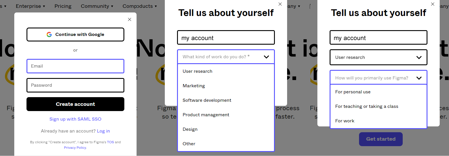
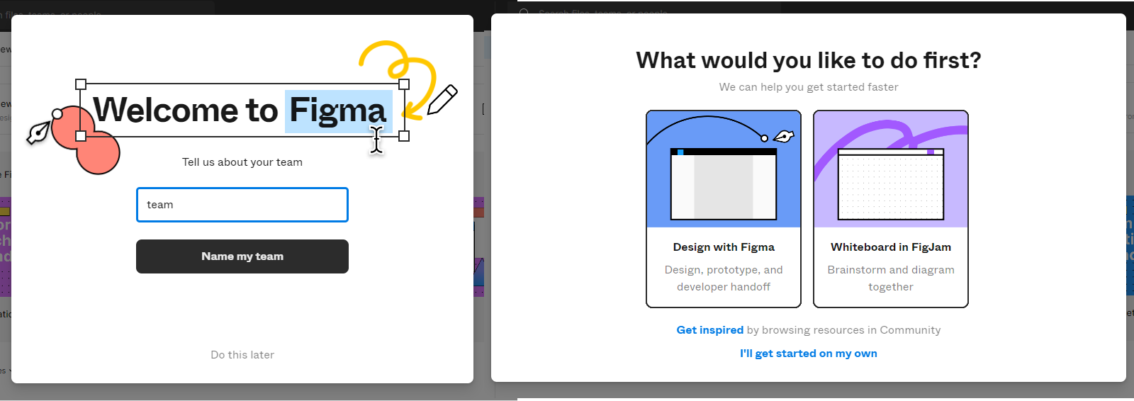
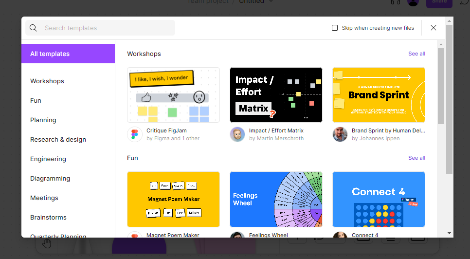
Figma collaboration SaaS has a caring step-by-step registration with eight steps that could scare an ordinary user in one registration form.
Convenient Access to Support
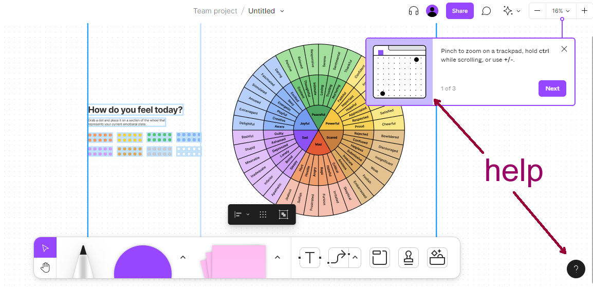
The help system should be easy to apply from anywhere in the application. When users get stuck and need help this is frustrating by itself, but if they have to dig and wait for support this makes the SaaS experience much worse.
FAQ. The block of FAQs is a typical help that users quickly find on a site or an app. But there are more ways to give a hand to your client.
Online support with pop-up chats or bots has also become a tradition. This method to deal with user complaints and service bugs is essential in the case of a younger audience.
Video tutorials are another support option. Nowadays, most users prefer listening and watching the helping instruction rather than reading it.
Animated tips. Figma service demonstrates animated helping tips, that don`t irritate but smoothly accompany your dive into the SaaS.
Import Opportunities
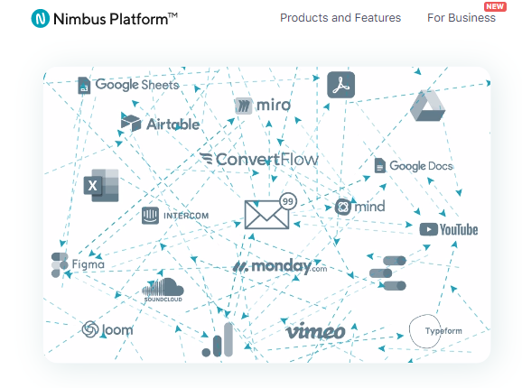
Online work and education demand a caleidoscope of files and formats from Google Sheets, Powerpoint presentations, Excel, and other collaboration tools. When your SaaS supports mass import this is a strong advantage for your client and your client’s DevOps team. No time is wasted on switching back and forth between digital software and all the stakeholders win.
Data Access
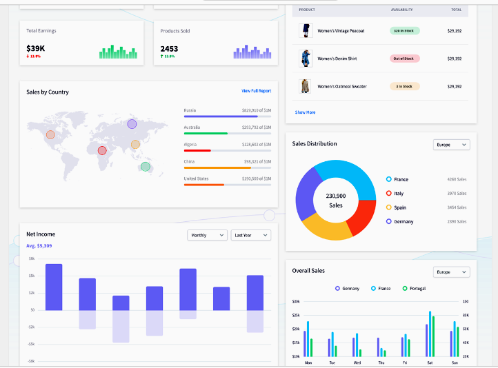
A site or an app related to data delivery should give the client quick access to KPIs and essential metrics. Visualization through dashboards and charts for reports and project tracking is hard to overestimate.
A good study example would be the Adobe XD Dashboard UI Kit – imperkable. The SaaS helps build data visualization within Adobe XD.
SaaS UI Patterns
User interface design is a purely digital term that reminds touchscreen on your smartphone or the touchpad of a coffee machine. Here are some proven rules that could improve the visual comprehension of your software UI.
Intuitive interface
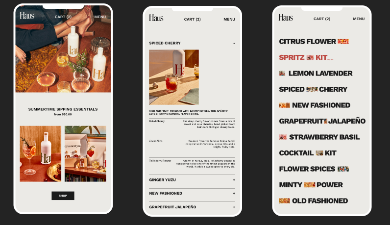
The best way to retain the users is to secure their smooth and seamless journey through the service. Show what they need to know even before clients expect this information. Encourage your visitors to click more with clear fonts and relative visuals, such as the Drink Haus case.
Diversify Pagination
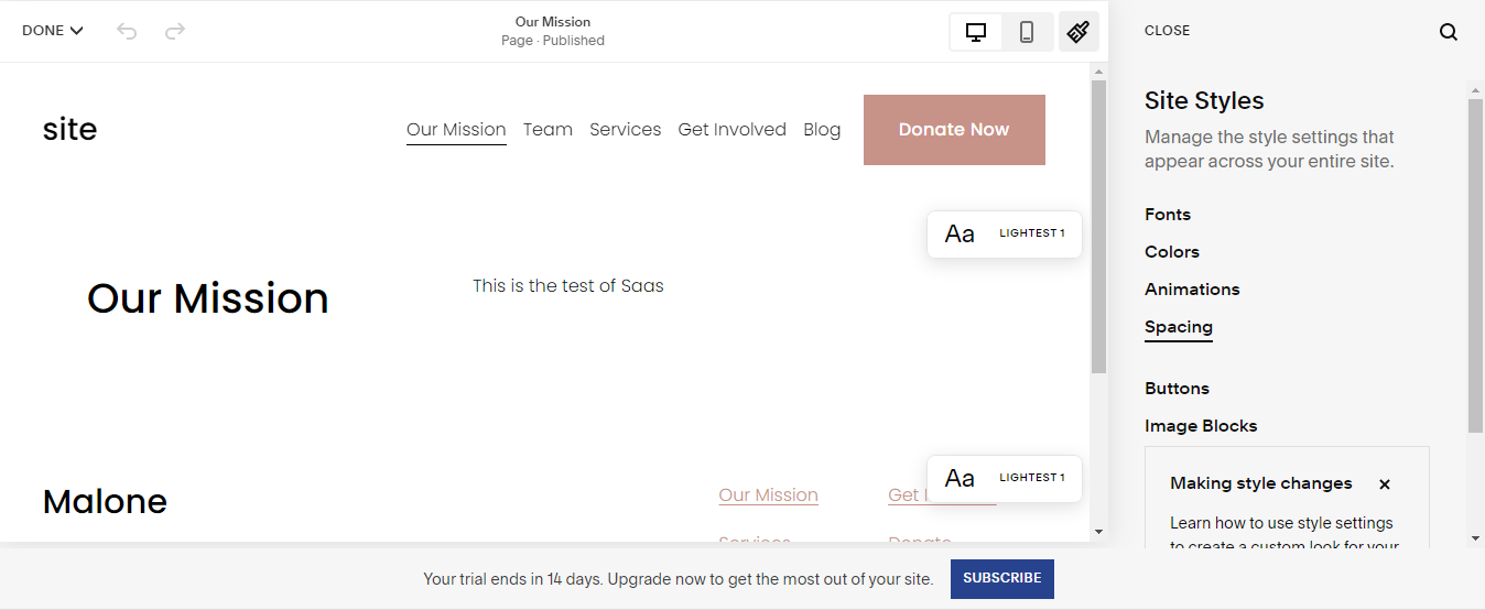
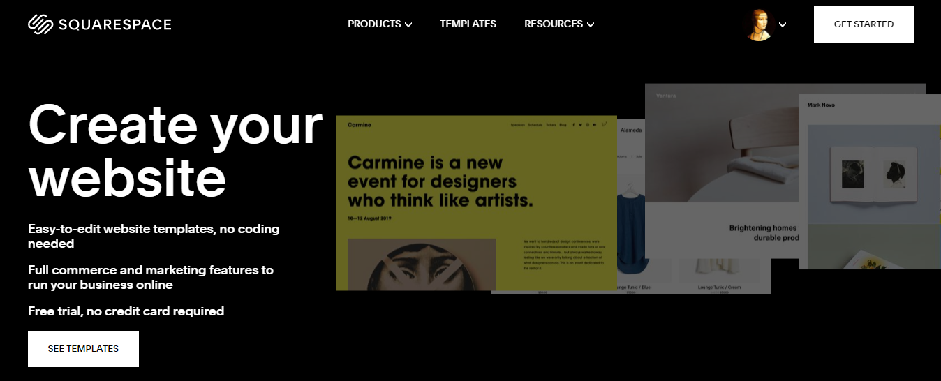
Sometimes the number of pages with various dashboards is confusing. Therefore, it`s advisable to separate different data through the pagination layouts like the Squarespace SaaS for site creation.
Keep it Simple
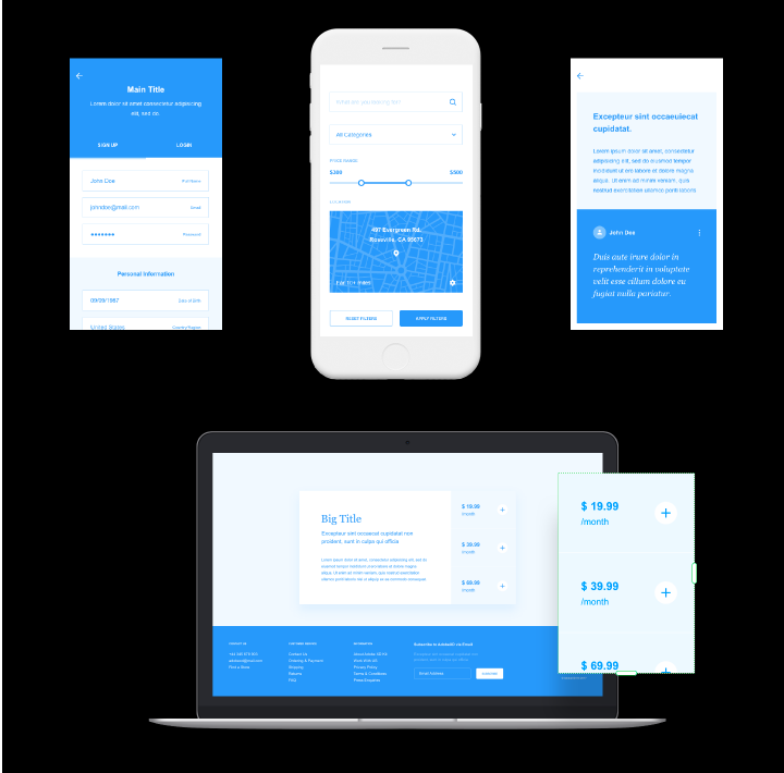
In the case of the Wires wireframe kit for Adobe XD trendy minimalistic two-color palette, nothing distracts the user’s attention from the information on a mobile or a laptop screen.
Bold CTAs
The eye-catching call-to-action button is the obvious advantage of your first screen. You might also want to keep close to the customer by using a sticky menu.
Success stories
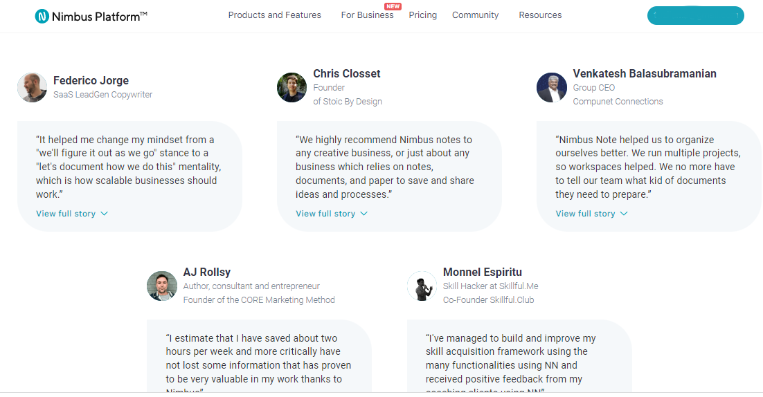
People trust a service more when they see happy clients’ feedback. The detailed description of a solved problem also persuades clients to contact the company.
Dark Mode
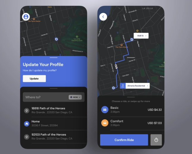
Another tip to stand out from the crowd is a dark mode, which reduces eye strain and saves the battery charge.
Mobile-friendliness
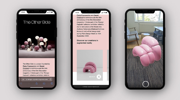
A mobile version is a must-have for any product, including designer furniture. The Other Side app helps visualize furniture items in different interiors and decide how the pink chair fits into your house.
Devox UX/UI Experience To Lure Up Your SaaS
We perceive the internet era as users and feel the unstoppable competition on the digital market as a company or an entrepreneur. With the help of our tips for SaaS best practices, a fast learner can improve the existing software solution step by step.
But if you need UI/UX experts, our team can audit your SaaS software to make it more user-friendly and responsive. We also create UX from scratch and perform comprehensive testing to ensure the reliability of your SaaS solution.
We know that choosing a competent and reliable software developer is an exhausting quest and tough decision. Devox Software’s major benefits include a large talent pool, a Western mindset, and affordable rates. But still, it’s better to avoid rushing and start cooperation with small and secure steps. Drop us a line to see if dedicated Devox UX/UI designers could suggest valuable improvements for your SaaS software.


